The Design Evolution of Epoxy.tv, Sharing Tools
Project description
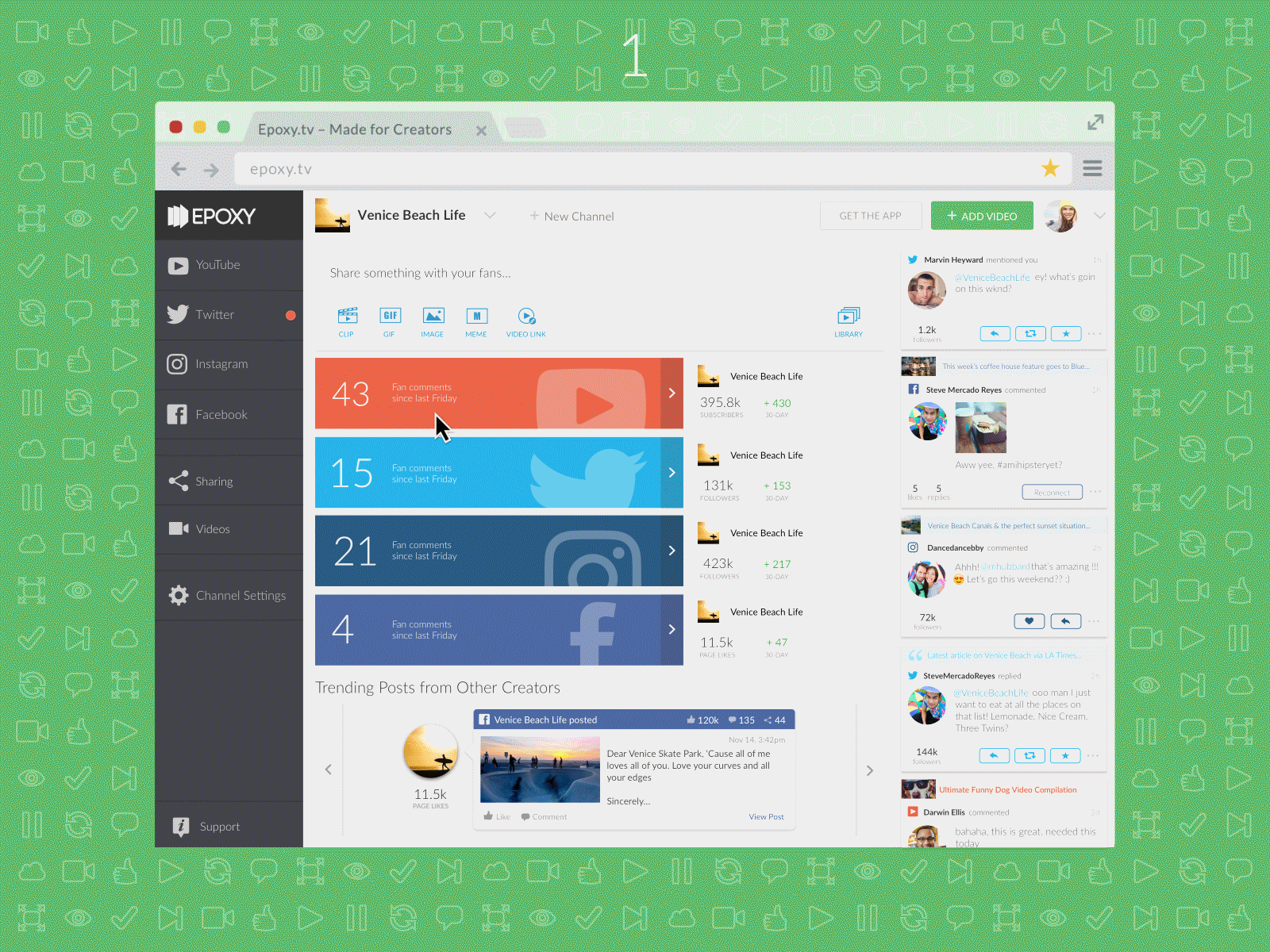
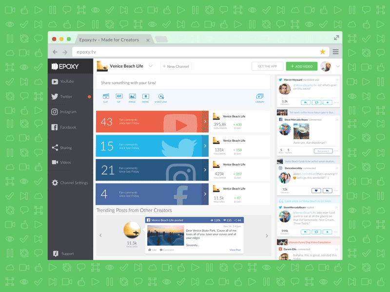
Sharing consisted of everything that we would ask our user to output. Whether it was posting a simple Facebook update through our platform, or sending off a tweet… to something as robust as creating Memes, GIFs, and slicing video clips on our site. Per the evolution of our product, low commitment posting features came first and were eventually followed by a suite of creation tools.
This segmentation in design was starting to create a disjointed user experience; we were guiding all users along the same journey regardless of intention. In order to parallel the user experience with the fullness of our features, a redesign was called upon.
Challenges
The challenge here was to focus on a flow driven upgrade while keeping the functionality in tact, to manage the delicate balance of improvement and disruption. The progress was to be monitored by the metric: # of shares.
Process
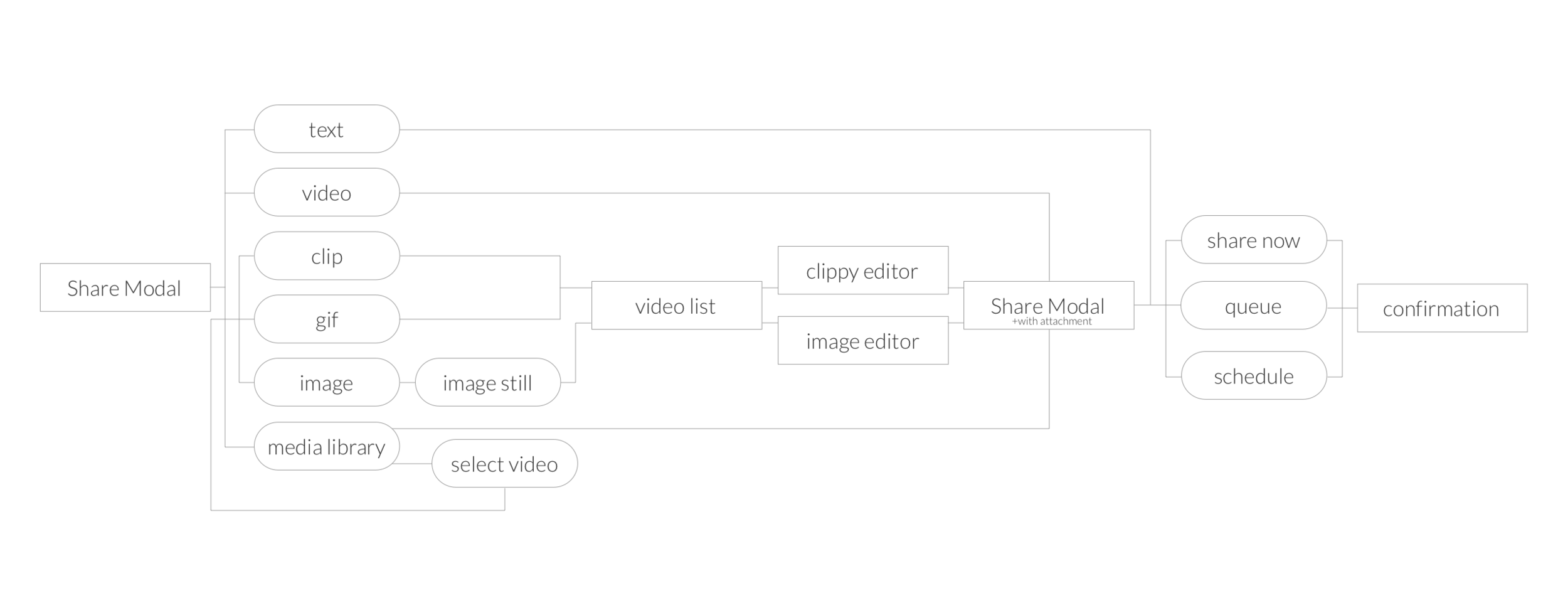
I initiated by going straight into the source, dissecting information architecture, auditing all screens that currently existed in hopes of finding instances of overlap and opportunities to streamline.
In hopes of finding answers to:
1. What journeys are our users currently embarking on?
2. Are there any entryways that are currently being overlooked?
3. Are there screens/features that aren’t really being used. Why?
4. Are there user needs that we aren’t currently solving for?


This audit process distilled a singular flow that would serve all user journeys our product was currently supporting.
Initial solutions
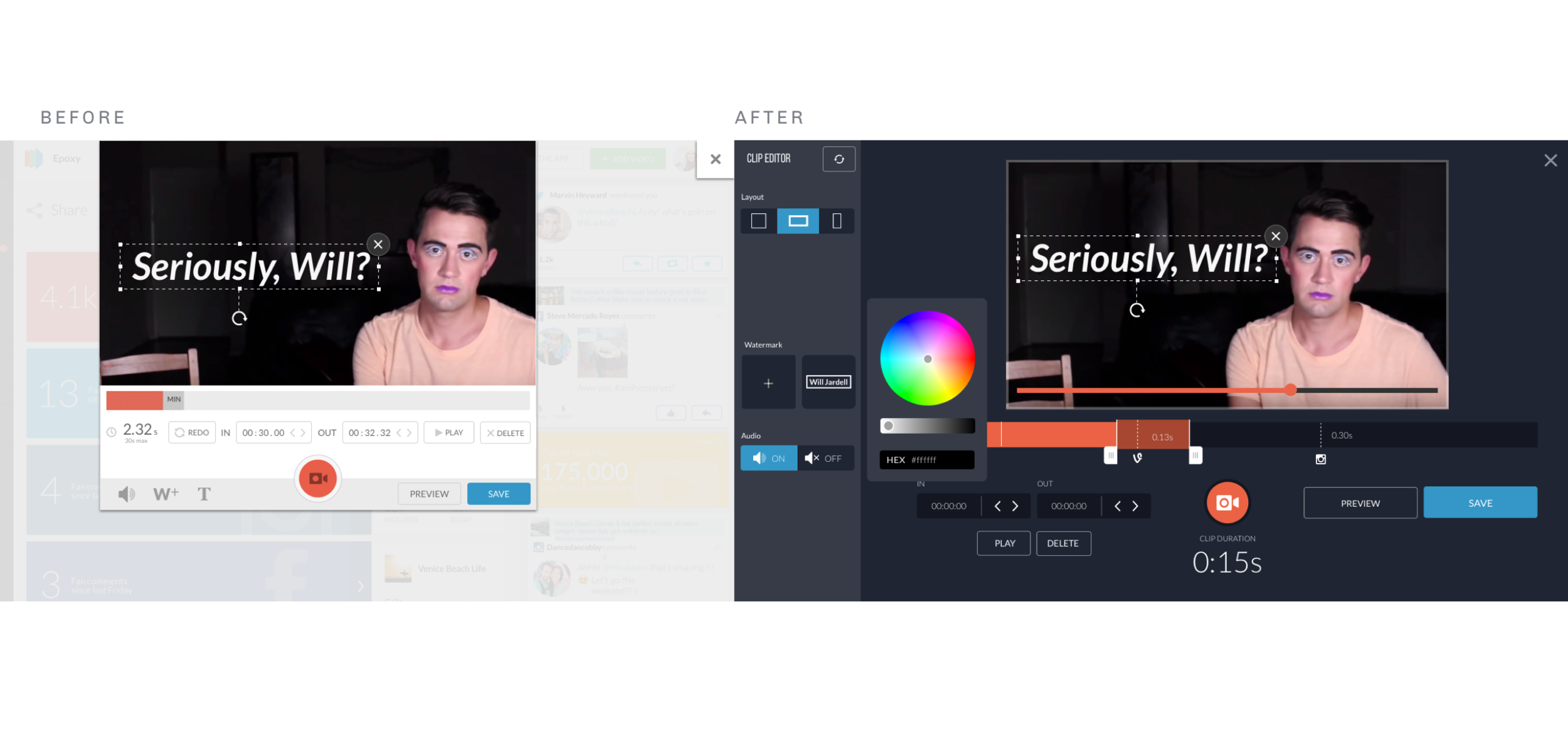
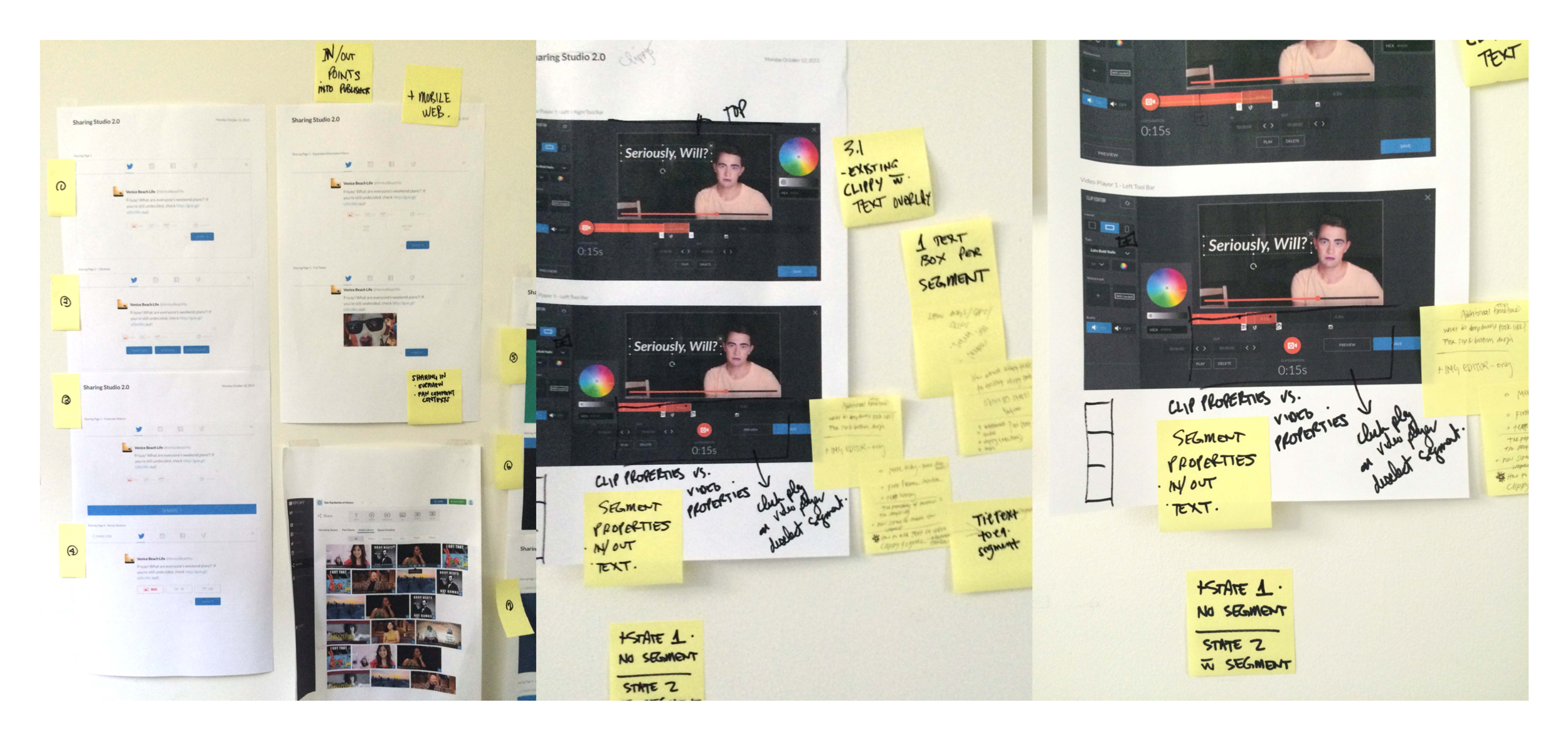
I explored various possibilities, veering off into “blue sky” proposals, incremental updates, and everything in between.
The following slideshow is an exploration of a full screen sharing experience.
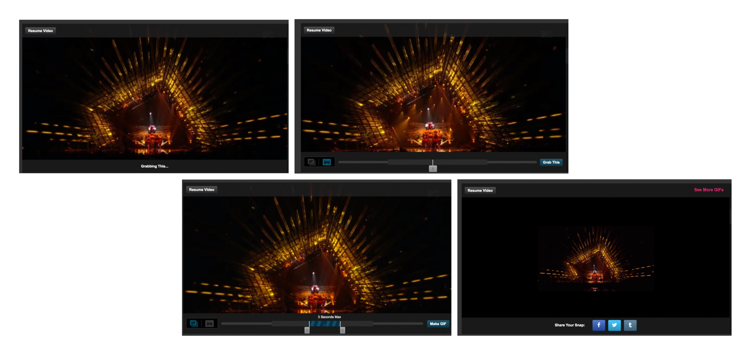

results of user testing
Upon incorporating user feedback and engineering perspectives, we decided to keep this version as a “north star” design to eventually build towards. It would be too jarring to implement all at once since this flow was such a core component of our app.

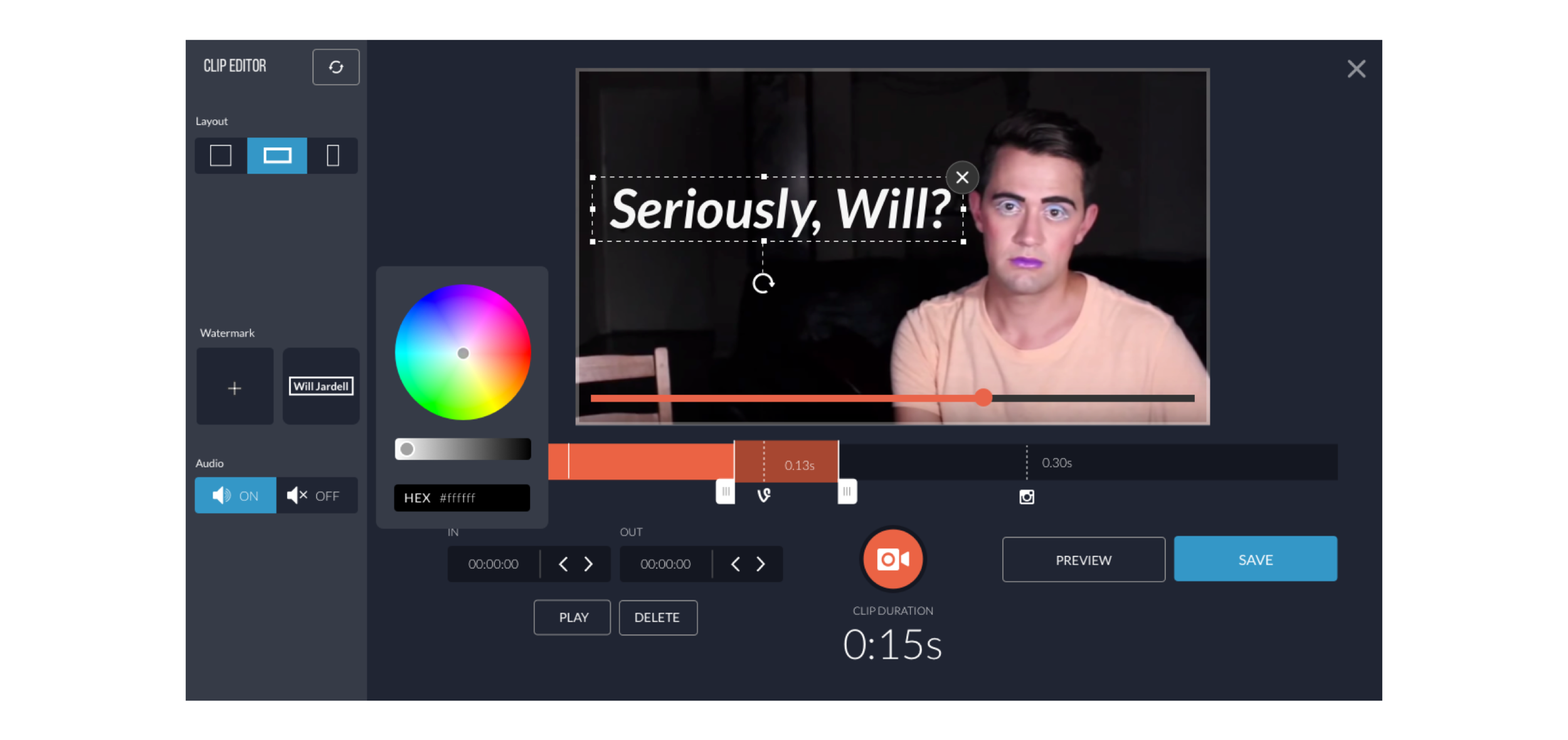
Exporations, continued
Results
We concluded a solution that integrated seamlessly into all areas of the app that this flow was affected by. I was able to affect this because of the information architecture and mapping that was done beforehand. We enabled users to dictate the journey of their flow from multiple entry points. Another crossroad that we came across during this process was… depending on type of media the user desired to share, the platform in which it lived would be limited. A way we included this solution
Conclusion
The redesign was extremely successful with a 45.8% increase in feature usage. The number of shares jumped from 5,388 a week to 7,859.